How to Create a Mobile-Friendly Invitation Website
By Link of Time • Published Feb 17, 2026 • Updated Mar 08, 2026
Your guests are far more likely to open your invitation on a phone than on a laptop. From quick RSVP taps to checking directions on the go, a mobile-friendly invitation website is no longer optional—it’s essential. If your event page isn’t optimized for mobile, you risk lower engagement, missed RSVPs, and frustrated guests.
In this guide, you’ll learn how to create a mobile-friendly invitation website using Link of Time, why mobile optimization matters, and the practical steps you can take to ensure your event looks great on any screen.
Why Mobile-Friendly Invitation Websites Matter
More than half of all web traffic now comes from mobile devices, and event invitations are no exception. Guests often open invitations from messaging apps, social media, or email—almost always on their phones.
A mobile-friendly invitation website helps you:
- Improve RSVP response rates
- Make event details easy to read at a glance
- Ensure buttons, links, and forms are easy to tap
- Provide a smoother guest experience overall
Google also prioritizes mobile-friendly pages in search results, which is why mobile optimization is considered a best practice in modern web design.
Mobile Optimization Starts During Event Creation
Built-In Mobile Design on Link of Time
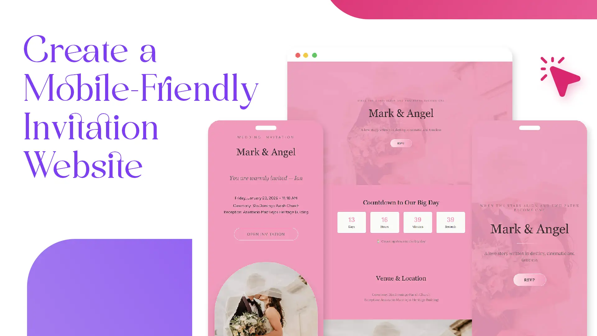
When you create an invitation website on Link of Time, mobile optimization is handled automatically. All templates are designed to be responsive, meaning they adapt seamlessly to different screen sizes—phones, tablets, and desktops.
As soon as you finish the 3-step setup process, your invitation page is already optimized for mobile viewing. This same flow is explained in setting up your invitation website from scratch, where design and usability are built in from the start.
Key Mobile-Friendly Features to Look For
Responsive Layout and Text Scaling
A mobile-friendly invitation website adjusts font sizes, spacing, and layout so guests don’t need to zoom or scroll horizontally. Event titles, dates, and locations remain clear even on smaller screens.
Tap-Friendly Buttons and Forms
RSVP buttons, navigation links, and form fields are designed to be easy to tap with a thumb. This is especially important for guests responding quickly while on the move.
Fast Loading Times
Mobile users expect pages to load quickly. Link of Time invitation pages are optimized to load efficiently, even on slower mobile connections. Lightweight layouts and optimized images help reduce delays.
How to Keep Your Invitation Mobile-Friendly Over Time
Editing Event Details Without Breaking Mobile Design
If your event details change, you can update them anytime from your event dashboard by clicking Edit Event. You’ll go through the same creation steps again, and updates reflect in real time—without affecting mobile responsiveness.
This update process is covered in more detail in editing your event after sending invitations, ensuring guests always see the latest information on any device.
Using One Simple Link for Easy Sharing
A mobile-friendly site works best when it’s easy to access. Sharing a single invitation link allows guests to open your event instantly on their phones via messaging apps or social media. This strategy is explained further in sharing your invitation website efficiently.
Common Mistakes to Avoid
Even with a responsive platform, a few choices can affect mobile usability:
- Uploading images with text that’s too small to read
- Adding overly long paragraphs instead of scannable sections
- Forgetting to preview your page on a phone before sharing
Taking a minute to check your invitation on your own device can prevent these issues.
Frequently Asked Questions
Final Thoughts
Creating a mobile-friendly invitation website doesn’t require technical skills when the platform is built with mobile users in mind. With Link of Time, responsive design, tap-friendly features, and fast loading are already included—so your guests enjoy a smooth experience wherever they are.
Ready to invite your guests the modern way? Create your mobile-friendly invitation website today and make every tap count.
Comments
No comments yet.